Jim Lovell is a landscape photographer based in Hobart, Tasmania. Jim's recent work has been focused on capturing the essential elements of the Tasmanian landscape using long exposure techniques.
In the first hint of this series I suggested that lots of practice is a great way of getting better results. We learn a lot from experience, making mistakes and trying again. It's great then to have a favourite location that's not too far away so you can keep going back to try different things, or to attempt the same photo but correct the mistakes you might have made the last time. Experiment with different times of day and year, weather conditions, long and short exposure times etc. Landscape photographers generally like the light around sunrise and sunset. Photos of waterfalls or forest scenes seem to work best of overcast days.
Here's a photo of one of my favourite return-to spots... "Secret Falls"
When taking a picture, think about what it is that you want the viewer to see. Why are you taking the picture? How are you going to emphasise the subject?
Minimising distractions is a good thing to try but you can also use leading lines: things in the scene to draw the viewer's eye in to the subject. Here are a couple of examples.
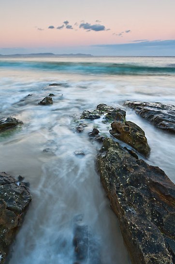
The first one was taken at sunset on Bruny Island. I had my camera on a tripod, quite low down and just at the limit of where the waves were coming up the beach. There were some rocks with straight edges going down toward the waves so I put the camera between them. The rocks frame an open triangle pointing into the picture and hopefully lead the eye to the breaking wave and the land on the horizon. Something else that helps here is the long exposure (a few seconds I think). As the water rushes out it leaves foam and bubbles that blur and also create lines to lead the viewer's eye.
Sunset at Adventure Bay, Bruny Island
Here's another one of the kids (quite a while ago now!) riding their bikes in a park. This park has a curvy 'railway line' painted on the path. Curved lines are great for creating interest and again, getting low down and making the path run up from the bottom of the frame leads the eye in. Note also that Patrick is at the intersection of two one-third lines (the rule of thirds again!). This one was taken with my iPhone and then just a little tweaking later on to darken the foreground a little.
One of the things I like most about digital photography is that there's no film: pressing the shutter button costs nothing. This means you're free to experiment with camera settings, composition and lighting and you can see the results immediately. I bought my first digital camera way back in 2002 (it had a whopping 2 megapixels!) but I learnt a lot from books and on-line, and by just taking lots of photos.
This post is the first in a series that summarises some tips and techniques I've pick up over the years, things I wish I'd known when I started playing with digital cameras 9 years ago. The first one is a simple rule that can really help improve the composition of a photo: the Rule of Thirds.
Rule of Thirds
Images generally look better if the main subject is offset from the centre, and in many cases the Rule of Thirds can be used to help decide on the best composition. When looking through the viewfinder, imagine that the frame is divided into a regular 3 by 3 grid, like this:
Try composing the photo so that the main subject is at the intersection of a pair of these lines and/or one of these lines follows the horizon. Here's an example:
Note how the horizon follows the lower one-third line and the brightest part of the sky is lined up to intersect with a vertical one-third line. For a landscape, deciding where to put the horizon depends on what the photo is about. In the case of this photo, it's obviously the dramatic stormy sky at sunrise, and the sun beginning to break through the clouds. In the following example, it's the amazing reflections in the water on a very still morning:
Mt Rugby Reflections, Bathurst Harbour
The horizon is placed near the upper line, leaving plenty of room for the reflections. And here's an example of a portrait of my son taken using the rule of thirds with his face on a vertical one-third line:
I put his face on the left line so that his shoulders were turned in toward the centre of the frame. It's usually good to have the subject turned toward or moving into the centre of the image. The photo would have looked odd on the right hand line in this case.
In fact many cameras and camera phones give you the option of overlaying a 3 by 3 grid over the live view of the scene. It's worth turning this feature on if you have it so you can line up on the grid.
One last thing: rules were meant to be broken! While the rule of thirds works well in many cases, it may not for every situation. Some very striking images can be made with the subject dead centre.